In a landscape crowded with numerous healthcare options, a well-crafted brand can significantly differentiate your medical practice from your competitors. And just like anything in life, planning is key to ensuring that your brand effectively communicates your values, expertise, and unique approach to patient care to your target audience.
This foresight in branding strategy not only establishes a strong market presence but also sets the stage for a deeper exploration into the nuances of brand development.
Why branding matters for medical practices
Branding plays a crucial role in the healthcare industry, especially in medical practices. By establishing a strong, recognisable identity, you’re fostering trust among your patients – making it easier for them to choose and remain loyal to your business. How? For one, your identity is more than just a logo or a colour scheme: it represents the values, quality of care, and your unique approach. Secondly, consistent branding is crucial for building brand equity, enhancing recognition, and establishing a professional image. It also ensures consistent communication, aligning every message with your brand’s strategy and values.
By creating a strong brand, you’re subconsciously conveying a sense of professionalism and reliability, reassuring patients that they are in capable hands. This differentiation is vital in guiding patient choices, as healthcare decisions are often made based on trust, connection, and perceived quality of care. Branding isn’t just an aesthetic choice: it’s a strategic tool that can enhance patient engagement and confidence, and ultimately the success of your practice.
The importance of proactively planning your branding
Early planning is vital for ensuring brand identity consistency, allowing for a strategic selection of colours, fonts, and imagery that resonate with your community. Haphazard or rushed branding can lead to a fragmented identity. This lapse in judgment could result in misrepresenting your brand’s values and undermining patient trust and credibility. Inconsistent branding may fail to connect with your target audience, leading to potential rebranding costs and efforts in the future.
With that in mind, there’s no better time than now to take action and invest in thoughtful branding to make your mark.
Choosing the correct colour palette
When thoughtfully selected, your colour palette can significantly enhance your patient experience.
- For psychological impact: Colours have the power to evoke emotions and affect mood. In healthcare settings, choosing the right colour palette can create a calming and healing environment. For instance, blues and greens are often used for their soothing and restorative properties, helping to reduce anxiety and create a sense of tranquillity.
- To convey trust and professionalism: Certain colours are better suited for conveying trust and professionalism – two key components in a medical practice. Blues, for example, are associated with dependability and calmness, while greens signify growth and balance. Using these colours can help patients feel more at ease and confident in the care they’re receiving.
- Instil a comfortable and welcoming atmosphere: Colours also play a role in creating a comfortable and welcoming atmosphere. Warmer tones like soft yellows or earthy greens can make a space feel more inviting and less clinical, which is particularly beneficial in spaces like waiting rooms or consultation areas. For paediatric areas, brighter colours like light purples, cheerful yellows, or gentle blues can be uplifting and engaging for younger patients.
Design style for a lasting impression
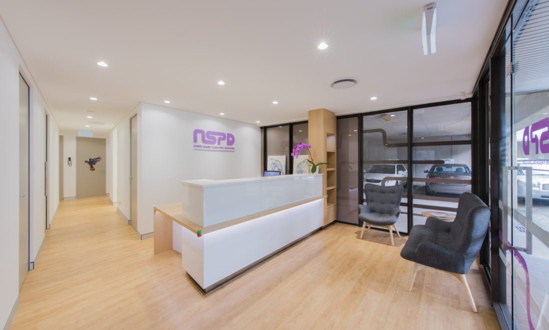
Selecting a design style that reflects your practice’s core values and mission is crucial in establishing brand identity. It ensures that the visual elements communicate the right message and vibe to your patients, aligning with what your practice stands for.
Here are some things to consider:
- Modern and minimalist: Characterised by clean lines, simple colour schemes, and uncluttered layouts, the modern and minimalist approach conveys efficiency and a forward-thinking approach. For example, a dermatology clinic might use a sleek, minimalist design with a black-and-white colour scheme and modern typography to convey sophistication and cutting-edge technology.
- Classic and traditional: Using more formal fonts and a muted colour palette, the classic and traditional look creates a sense of timelessness and reliability. A family medicine practice might adopt a classic design with warm colours and serif fonts to project an image of long-standing trust and comprehensive care.
- Friendly and approachable: Often incorporating bright colours, rounded shapes, and informal typography to create a welcoming and accessible feel, this style is ideal for paediatric or family practices.
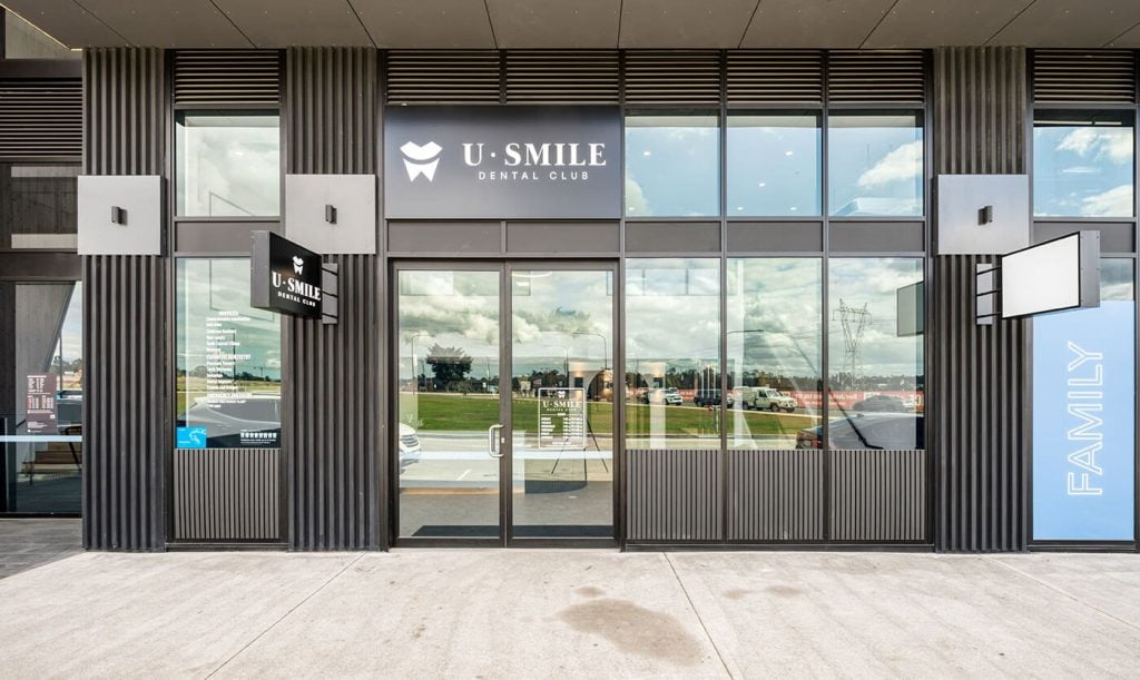
Creating standout signage
Effective signage conveys a sense of order, care, and attention to detail that reflects your practice’s professionalism and commitment to patient experience. The importance of clear, legible, and aesthetically pleasing signage cannot be overstated. Signs should be easily readable from a distance, with fonts and colours that stand out yet remain consistent with the overall branding of your practice. For example, a hospital might use bold, sans-serif fonts in its signage for ease of reading, combined with colour-coded sections to aid navigation. In a smaller clinic, elegant, serif fonts on a simple background might be used to convey a sense of sophistication and attention to personal care.
Talk to our professional branding team today
Over the years, we’ve worked with many healthcare practices to effectively plan and execute cohesive branding elements. Read our case studies for inspiration, or contact Perfect Practice today to help you design a space to amplify your brand.


